
Responsive Web Design: Complete Guide for Beginners in 2026
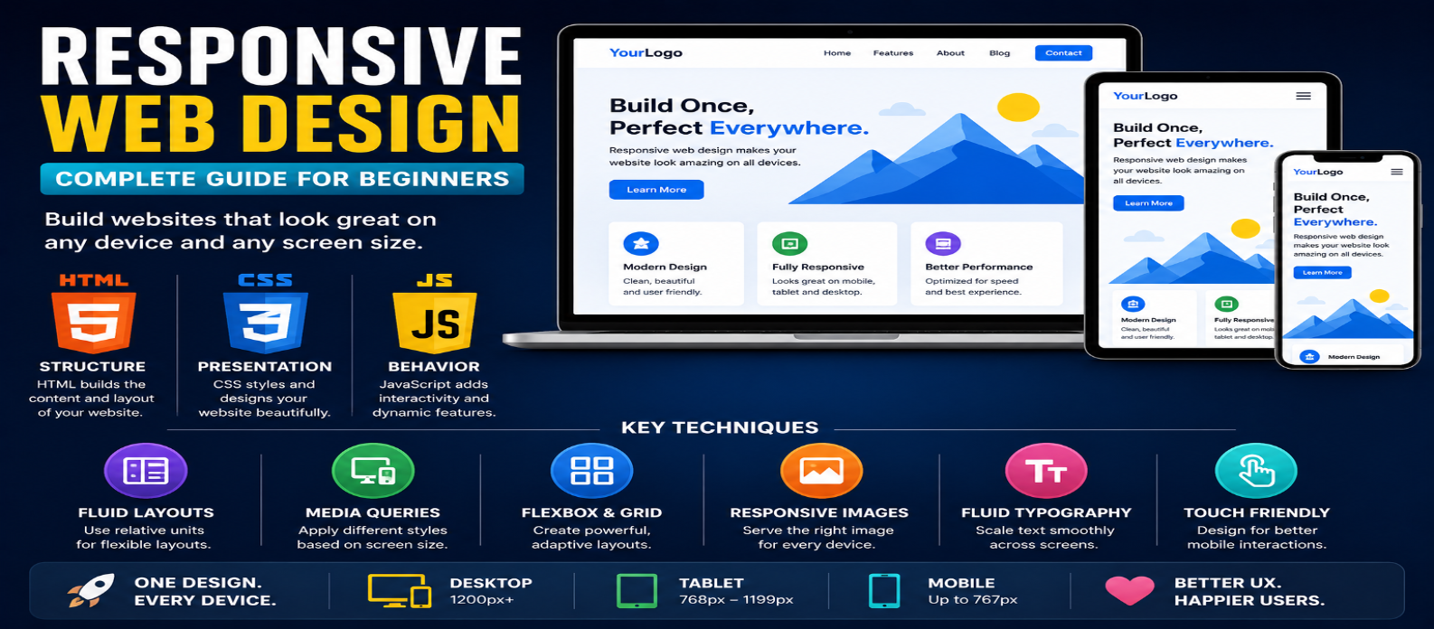
"Learn responsive web design from scratch with practical examples covering mobile-first CSS, media queries, Flexbox, Grid, responsive images, fluid typography, container queries, and testing."
Responsive Web Design: Complete Guide for Beginners in 2026
A website might look perfect on a laptop and become frustrating on a phone: text becomes tiny, navigation doesn't fit, images overflow, and users are forced to zoom or scroll sideways.
Responsive web design (RWD) solves this problem by creating layouts that adapt to different screen sizes and available space.
Instead of building separate websites for phones, tablets, and desktops, responsive design allows one website to adjust its layout using flexible CSS, media queries, responsive images, and modern layout techniques.
What Is Responsive Web Design?
Responsive web design is an approach where a webpage adapts to the user's screen and device characteristics.
A responsive layout might display:
Desktop: 3-column product grid
Tablet: 2-column product grid
Mobile: 1-column product grid
The content remains the same, but its presentation changes to fit the available space.
Responsive design isn't simply about making everything smaller. The goal is to keep content readable, usable, and appropriately arranged across different screen sizes.
Start With the Viewport
For most responsive pages, include the viewport meta tag:
<meta
  name="viewport"
  content="width=device-width, initial-scale=1"
>
Without appropriate viewport configuration, mobile browsers may render the page using a wider virtual viewport and scale it down.
This single line belongs inside the document's <head>.
Use Flexible Widths
A common beginner mistake is building layouts around rigid widths:
.container {
  width: 1200px;
}
That container can overflow on a screen narrower than 1200 pixels.
A more flexible approach is:
.container {
  width: min(100% - 2rem, 1200px);
  margin-inline: auto;
}
Now the container can shrink with the viewport while still having a maximum practical width.
The principle is simple:
Prefer adaptable dimensions when the design doesn't require fixed dimensions.
Mobile-First Responsive Design
A useful approach is to design the basic layout for smaller screens first, then add enhancements as more space becomes available.
Example:
.cards {
  display: grid;
  grid-template-columns: 1fr;
  gap: 1rem;
}

@media (min-width: 768px) {
  .cards {
    grid-template-columns: repeat(2, 1fr);
  }
}

@media (min-width: 1100px) {
  .cards {
    grid-template-columns: repeat(3, 1fr);
  }
}
The default is one column.
Larger layouts are introduced only when enough space exists.
This often keeps CSS easier to reason about than starting with a complex desktop layout and repeatedly overriding it for smaller screens.
Understanding Media Queries
Media queries apply CSS when specified conditions are true.
Example:
@media (max-width: 600px) {
  .sidebar {
    display: none;
  }
}
However, don't choose breakpoints only because a particular phone or tablet has that width.
A better approach is to resize your layout and add a breakpoint when the content or design actually needs one.
For example, if navigation starts becoming crowded at 720px, that's a meaningful place to reconsider its layout.
Responsive Layouts With Flexbox
Flexbox is useful for layouts where elements need to align and adapt along a row or column.
.features {
  display: flex;
  flex-wrap: wrap;
  gap: 1rem;
}

.feature {
  flex: 1 1 250px;
}
Each item aims for roughly 250px but can grow or shrink.
If there isn't enough horizontal space, items wrap automatically.
This can reduce the number of media queries required.
Responsive Layouts With CSS Grid
CSS Grid is especially useful for responsive card layouts.
.products {
  display: grid;
  grid-template-columns:
    repeat(auto-fit, minmax(min(250px, 100%), 1fr));
  gap: 1.5rem;
}
This tells the browser to create as many suitable columns as available space allows.
On wide screens, several cards can appear in a row.
As the container becomes narrower, the grid automatically reduces the number of columns.
Modern CSS can often make responsiveness content-driven instead of breakpoint-heavy.
Make Images Responsive
Large images shouldn't overflow their containers.
A common baseline rule is:
img {
  max-width: 100%;
  height: auto;
}
This allows images to shrink while preserving their aspect ratio.
HTML also supports responsive image features such as srcset, sizes, and <picture> when different image resolutions or crops are appropriate.
For example:
<img
  src="photo-800.jpg"
  srcset="
    photo-480.jpg 480w,
    photo-800.jpg 800w,
    photo-1200.jpg 1200w
  "
  alt="Mountain landscape"
>
The browser can use the available information to choose an appropriate image resource.
Use Fluid Typography Carefully
Text doesn't always need abrupt font-size changes at breakpoints.
CSS clamp() can create controlled fluid sizing:
h1 {
  font-size: clamp(2rem, 5vw, 4rem);
}
This gives the heading:
- A minimum size
- A flexible preferred size
- A maximum size
Fluid typography can create smoother transitions between viewport sizes, but readability should remain the priority.
Don't Forget Navigation
Navigation is one of the most noticeable responsive-design challenges.
A desktop navigation bar might have room for several links:
Home | Tools | Blog | About | ContactOn a narrow screen, the same layout may no longer fit.
Possible solutions include:
- Wrapping navigation where appropriate
- Using a compact menu
- Prioritizing important links
- Changing layout direction
- Providing an accessible expandable navigation
If JavaScript controls a mobile menu, remember accessibility details such as keyboard operation, focus behavior, button semantics, and communicating expanded/collapsed state.
Responsive Design Is More Than Screen Width
A responsive website should also consider how people interact with it.
Small touch targets may be easy to click with a mouse but frustrating on a touchscreen.
Forms should remain usable without horizontal scrolling.
Text should remain comfortably readable.
Important content shouldn't disappear simply because the viewport is narrow.
Responsive design is ultimately about adapting the experience, not just rearranging boxes.
Container Queries
Traditional media queries respond primarily to characteristics such as viewport width.
Container queries allow a component to respond to the size of its containing element.
Example:
.card-wrapper {
  container-type: inline-size;
}

@container (min-width: 500px) {
  .card {
    display: grid;
    grid-template-columns: 1fr 2fr;
  }
}
This is useful for reusable components.
The same card might appear in a wide main-content area or a narrow sidebar and adapt based on the space actually available to it.
Common Responsive Design Mistakes
Using Too Many Breakpoints
You don't need separate CSS for every popular phone model. Let the content determine when layout changes are necessary.
Fixed Widths Everywhere
Rigid widths frequently create overflow. Prefer flexible sizing where possible.
Hiding Important Content
Mobile users usually deserve access to the same essential information as desktop users.
Testing Only One Phone Size
A layout that works at 390px may break at 500px, 800px, or somewhere in between.
Forgetting Long Content
Test long headings, large numbers, unusual usernames, translated text, and other content that can stretch components.
How to Test a Responsive Website
Don't test only at a few preset device sizes.
Resize the browser gradually from narrow to wide and look for:
Horizontal Overflow → Crowded Text → Broken Navigation → Awkward Gaps → Oversized Images → Unusable Controls
Browser responsive-design tools are useful, but testing on actual devices when available can reveal issues involving touch interaction, browser interfaces, and real-world usage.
A Simple Responsive Design Workflow
For a new page, use this process:
1. Build semantic HTML
2. Create a simple mobile layout
3. Use flexible sizing
4. Add Grid or Flexbox
5. Resize until something looks wrong
6. Add a breakpoint only when needed
7. Optimize images and typography
8. Test navigation and forms
9. Check multiple viewport sizes
This produces more maintainable responsive CSS than designing around a long list of specific devices.
Conclusion
Responsive web design means creating websites that work comfortably across different screen sizes and available spaces.
For beginners, focus on a few fundamentals:
Viewport → Flexible Widths → Mobile-First CSS → Flexbox → Grid → Media Queries → Responsive Images
Then expand into fluid typography and container queries as your layouts become more advanced.
The best responsive website isn't the one with the most breakpoints. It's the one where users can read, navigate, interact, and complete their tasks comfortably regardless of the screen they're using.
Get a Free Access To 200+ Free Tools:
|
Home Page |
|
|
Calculator Tools |
|
|
Text & Converter Tools |
|
|
PDF & Image Tools |
|
|
Games & Developer Tools |
|
|
Resume Builder |