
Mobile Website Speed Optimization: Complete Guide for 2026
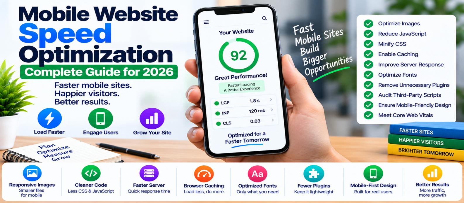
"Learn how to optimize mobile website speed using responsive images, lighter JavaScript and CSS, faster server response, caching, compression, optimized fonts, stable layouts and better Core Web Vitals."
Mobile Website Speed Optimization: Complete Guide for 2026
A website can feel instant on a powerful laptop and still be frustratingly slow on a phone.
Mobile visitors may have slower processors, limited memory, unstable networks, higher latency, and smaller screens. A page that downloads and executes excessive code therefore has fewer resources available to hide inefficiency.
Mobile optimization isn't simply making a desktop page responsive. It means designing the entire loading experience around what mobile users actually need.
Why Mobile Websites Become Slow
A mobile page has several potential bottlenecks:
Network
   ↓
Server Response
   ↓
HTML
   ↓
CSS + Fonts + Images + JavaScript
   ↓
Browser Processing
   ↓
Visible and Interactive Page
A delay anywhere in this chain affects the experience.
Common causes include oversized images, excessive JavaScript, slow servers, heavy third-party scripts, unnecessary fonts, and resources that compete with important above-the-fold content.
1. Test Like a Mobile Visitor
Don't evaluate mobile performance only by shrinking a desktop browser window.
Test representative pages under realistic mobile conditions, including:
- Homepage
- Articles
- Product or service pages
- Search
- Forms
- Checkout or other important flows
Look beyond a single performance score.
Check loading, scrolling, menu responsiveness, button interactions, form input, and visual stability.
A page isn't truly fast if it appears quickly but freezes when someone taps a button.
2. Prioritize Core Web Vitals
Three important performance signals are:
Largest Contentful Paint (LCP)
Measures loading performance.
A good LCP is 2.5 seconds or less.
Interaction to Next Paint (INP)
Measures responsiveness to user interactions.
A good INP is 200 milliseconds or less.
Cumulative Layout Shift (CLS)
Measures unexpected visual movement.
A good CLS is 0.1 or less.
When field data is available, evaluate these at the 75th percentile rather than judging performance from one unusually fast visit.
3. Send Smaller Images to Mobile Devices
A 4000-pixel photograph isn't necessary for a 400-pixel mobile display.
Responsive images allow the browser to select a more suitable file:
<img
  src="photo-800.webp"
  srcset="
    photo-400.webp 400w,
    photo-800.webp 800w,
    photo-1200.webp 1200w"
  sizes="100vw"
  width="800"
  height="600"
  alt="Example">
Also:
- Compress images
- Consider WebP or AVIF
- Avoid unnecessarily large dimensions
- Lazy-load appropriate offscreen images
Don't blindly lazy-load the main hero image if it is likely to become the LCP element.
4. Make Above-the-Fold Content Lightweight
Mobile users should not have to download half the website before seeing the main content.
Prioritize resources needed for the initial viewport.
Avoid filling the top of the page with:
- Large sliders
- Autoplay videos
- Multiple web fonts
- Heavy animation libraries
- Several third-party widgets
Ask a useful question:
What does the visitor need during the first few seconds?
Prioritize that.
5. Reduce JavaScript Aggressively
JavaScript can be especially expensive on less powerful phones.
The device must:
Download
   ↓
Parse
   ↓
Compile
   ↓
Execute
A smaller file isn't automatically lightweight if it performs expensive work after downloading.
Remove unused code, split large bundles, and load optional features only when required.
For example:
button.addEventListener("click", async () => {
  const module = await import("./advanced-editor.js");
  module.openEditor();
});
Visitors who never open the editor don't need to pay its initial loading cost.
6. Keep Touch Interactions Responsive
Mobile visitors interact through taps, scrolling, menus, filters, carousels, and forms.
If JavaScript blocks the main thread, these interactions may feel delayed.
To improve responsiveness:
- Break up expensive tasks
- Simplify event handlers
- Reduce unnecessary DOM updates
- Avoid excessive work during scrolling
- Audit third-party JavaScript
- Load complex functionality only when needed
Don't measure mobile performance only until the page looks finished. Test what happens when someone actually uses it.
7. Reduce Unnecessary CSS
Large stylesheets can contain code for components that don't exist on the current page.
Audit:
- Framework styles
- Old components
- Plugin CSS
- Desktop-only effects
- Duplicate rules
Remove genuinely unused styles and minify production CSS.
Be careful with automated removal tools: dynamically generated classes or states may look unused during a simple scan even though the website needs them.
8. Optimize Web Fonts
A mobile visitor shouldn't download a large font collection just because the design technically supports it.
Reduce unnecessary:
- Font families
- Weights
- Italic variants
- Icon fonts
Use efficient formats and appropriate font-display behavior.
Preload only fonts that are genuinely critical.
If your design works with two weights, loading eight provides little value.
9. Improve Server Response
Mobile optimization doesn't begin in the browser.
A slow server delays everything:
Slow Server
    ↓
Late HTML
    ↓
Late Resource Discovery
    ↓
Late Rendering
Investigate backend processing, database queries, caching, redirects, APIs, and server capacity.
Appropriate page or server caching can reduce repeated work for cacheable content.
10. Use Caching and Compression
Returning mobile visitors shouldn't repeatedly download unchanged static files.
Configure appropriate browser caching for:
- CSS
- JavaScript
- Images
- Fonts
Use HTTP compression such as Brotli or gzip where suitable for text-based resources.
Caching reduces repeated transfers. Compression reduces the amount of data transferred. Both can help, but they solve different problems.
11. Audit Third-Party Scripts
Third-party code can be particularly painful on mobile because it consumes both network and CPU resources.
Review:
- Advertising
- Analytics
- Chat widgets
- Social embeds
- Video players
- Marketing scripts
For every integration, ask:
Necessary?
    ↓
Needed immediately?
    ↓
Could load later?
Remove abandoned integrations and delay nonessential ones where appropriate.
12. Prevent Mobile Layout Shifts
Unexpected movement is especially frustrating on a small touchscreen.
A visitor may try to tap a button just as an advertisement or image pushes it elsewhere.
Reserve space for:
- Images
- Ads
- Embeds
- Banners
- Dynamic components
Providing image dimensions helps the browser reserve the correct aspect ratio before the file arrives.
13. Don't Hide Heavy Desktop Features With CSS
Consider:
@media (max-width: 600px) {
  .desktop-slider {
    display: none;
  }
}
The slider is invisible—but its assets may still be downloaded or executed depending on how the page is built.
Hiding something visually isn't the same as avoiding its performance cost.
When possible, don't send unnecessary functionality to mobile devices in the first place.
Mobile Speed Optimization Priority
If you discover many problems, start here:
1. Slow server response
2. LCP resource
3. Oversized images
4. Excessive JavaScript
5. Slow interactions
6. Render-blocking resources
7. Third-party scripts
8. Fonts
9. Caching and compression
10. Smaller refinements
The exact order should follow your measurements.
Mobile Performance Checklist
Before finishing an optimization pass, verify:
-
Real mobile pages are tested
-
Core Web Vitals are monitored
-
Responsive images are used
-
LCP resource is prioritized
-
Offscreen media is lazy-loaded appropriately
-
JavaScript workload is controlled
-
Touch interactions remain responsive
-
CSS is reasonably lean
-
Fonts are optimized
-
Server response is healthy
-
Caching and compression are configured
-
Third-party scripts are justified
-
Layout remains stable
-
Hidden desktop features aren't wasting mobile resources
Conclusion
Mobile website speed optimization is about doing less work on devices with fewer resources.
Send appropriately sized images. Reduce JavaScript. Prioritize visible content. Keep interactions responsive. Control fonts and third-party scripts. Improve the server. Prevent layout shifts.
Most importantly, test the experience as a mobile visitor would experience it.
A fast mobile website isn't simply a desktop site squeezed onto a smaller screen.
It's a website designed to download less, process less, render sooner, and respond faster.
Get a Free Access To 200+ Free Tools:
|
Home Page |
|
|
Calculator Tools |
|
|
Text & Converter Tools |
|
|
PDF & Image Tools |
|
|
Games & Developer Tools |
|
|
Resume Builder |