
Mobile-First Web Design: Complete Guide for Beginners in 2026
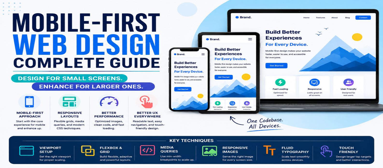
"Learn mobile-first web design with practical examples covering responsive layouts, min-width media queries, Flexbox, Grid, navigation, typography, images, forms, performance, and mobile usability."
Mobile-First Web Design: Complete Guide for Beginners in 2026
A website that works beautifully on a desktop can become difficult to use on a small screen. Navigation may become crowded, buttons may be hard to tap, and important content can disappear below oversized design elements.
Mobile-first web design approaches this problem from the opposite direction: start with the smallest practical layout, make the essential experience work well, and then enhance it as more screen space becomes available.
This guide explains how mobile-first design works, how it differs from simply making a site responsive, and how to build mobile-first layouts with modern HTML and CSS.
What Is Mobile-First Web Design?
Mobile-first design means creating the base experience for smaller screens before adding layout enhancements for larger ones.
Instead of:
Desktop Design → Remove/Shrink Features → Mobile
you work from:
Mobile Foundation → Tablet Enhancements → Desktop Enhancements
For example, a product grid might begin with one column:
.products {
  display: grid;
  grid-template-columns: 1fr;
  gap: 1rem;
}
Then expand when enough space becomes available:
@media (min-width: 700px) {
  .products {
    grid-template-columns: repeat(2, 1fr);
  }
}

@media (min-width: 1100px) {
  .products {
    grid-template-columns: repeat(4, 1fr);
  }
}
The small-screen layout is the default. Larger layouts are enhancements.
Mobile-First vs Responsive Design
These terms are related but aren't identical.
Responsive web design means a website adapts to different screen sizes and conditions.
Mobile-first design describes a strategy for creating that responsive experience.
A responsive website could be developed desktop-first:
.cards {
  grid-template-columns: repeat(4, 1fr);
}

@media (max-width: 600px) {
  .cards {
    grid-template-columns: 1fr;
  }
}
A mobile-first version starts simply:
.cards {
  grid-template-columns: 1fr;
}

@media (min-width: 900px) {
  .cards {
    grid-template-columns: repeat(4, 1fr);
  }
}
Both can produce responsive results. The difference is the direction from which the design is developed.
Why Start With Mobile?
Small screens force you to make decisions.
When space is limited, you need to identify:
- What content matters most?
- Which actions should be easiest to reach?
- Is the navigation unnecessarily complicated?
- Does the page need every visual element?
- Can users complete their task without frustration?
These decisions can improve the overall design rather than simply creating a smaller desktop page.
Mobile-first CSS can also reduce unnecessary overrides because simple styles form the foundation and complexity is added progressively.
Set the Viewport Correctly
A mobile-friendly HTML document should normally include:
<meta
  name="viewport"
  content="width=device-width, initial-scale=1"
>
This tells mobile browsers to use the device width appropriately when laying out the page.
Without suitable viewport configuration, even good responsive CSS may not behave as expected.
Build a Flexible Page Container
Avoid relying on large fixed widths.
Instead of:
.container {
  width: 1200px;
}
use a flexible approach:
.container {
  width: min(100% - 2rem, 1200px);
  margin-inline: auto;
}
On a phone, the container follows the available width with breathing room.
On larger displays, it stops growing after 1200px.
This pattern works without requiring a breakpoint just to control the basic page width.
Design Content Before Breakpoints
Don't begin a project by creating a long list of device widths.
Start with the content.
Imagine a pricing section containing three cards.
On a small screen:
.pricing {
  display: grid;
  gap: 1.5rem;
}
Now gradually increase the browser width.
When the layout has enough room for multiple cards comfortably, introduce the change:
@media (min-width: 800px) {
  .pricing {
    grid-template-columns:
      repeat(3, 1fr);
  }
}
This produces content-driven breakpoints rather than designing specifically for individual phone models.
Use Flexbox and Grid to Reduce Media Queries
Modern CSS can create flexible layouts without dozens of breakpoints.
For example:
.features {
  display: grid;
  grid-template-columns:
    repeat(auto-fit, minmax(min(240px, 100%), 1fr));
  gap: 1rem;
}
The browser automatically adjusts the number of columns based on available space.
Flexbox provides similar flexibility:
.actions {
  display: flex;
  flex-wrap: wrap;
  gap: 0.75rem;
}
Good mobile-first design isn't about adding media queries everywhere. It's about allowing the layout to adapt naturally whenever possible.
Make Navigation Mobile-Friendly
Desktop navigation often has plenty of horizontal space:
Home | Products | Services | Resources | Blog | ContactOn a phone, squeezing every link into one row usually creates a poor experience.
A mobile layout may use a clearly labeled expandable menu.
When implementing one, consider more than appearance:
- Use a real button for the menu control
- Make its state understandable
- Support keyboard interaction
- Keep important destinations accessible
- Avoid tiny tap targets
- Manage focus appropriately when needed
A mobile menu should simplify navigation, not hide it behind confusing interactions.
Design for Touch, Not Just Mouse Input
Desktop interfaces often assume precise mouse pointers.
Phones are operated primarily with fingers.
Avoid placing important controls extremely close together.
Instead of creating a row of tiny buttons, provide enough spacing for comfortable interaction.
Also remember that not every device fits neatly into "touch" or "mouse" categories. Responsive interfaces should remain usable with different input methods.
Make Typography Adapt
Mobile typography should be readable without requiring users to zoom.
Avoid extremely small text.
Headings can use clamp() to scale smoothly:
h1 {
  font-size: clamp(2rem, 7vw, 4rem);
  line-height: 1.1;
}
This establishes minimum and maximum sizes while allowing flexibility between them.
Also control line length on larger screens:
.article {
  max-width: 70ch;
}
A desktop screen being wider doesn't mean every paragraph should stretch across the entire display.
Optimize Images for Small Screens
A 2,500-pixel-wide image isn't automatically appropriate just because CSS displays it at 350 pixels.
At minimum, keep images flexible:
img {
  max-width: 100%;
  height: auto;
}
When appropriate, use responsive image features such as:
<img
  src="photo-800.jpg"
  srcset="
    photo-480.jpg 480w,
    photo-800.jpg 800w,
    photo-1200.jpg 1200w
  "
  sizes="100vw"
  alt="Example workspace"
>
This gives the browser information it can use when selecting an image resource.
Image optimization matters especially on mobile connections where unnecessary bytes can noticeably affect loading.
Don't Hide Important Content on Mobile
A common shortcut is:
@media (max-width: 600px) {
  .important-section {
    display: none;
  }
}
Sometimes hiding decorative elements is reasonable.
But removing important content or functionality simply because someone uses a smaller screen can create an incomplete experience.
Instead ask:
Can this content be reorganized, simplified, collapsed, or repositioned?
Mobile-first doesn't mean mobile users receive less value.
Forms Need Special Attention
Forms often expose weak mobile designs.
Keep forms straightforward:
input,
select,
textarea,
button {
  width: 100%;
}
Use appropriate HTML input types:
<input type="email">
<input type="tel">
<input type="date">
Provide visible labels and meaningful error messages.
On larger screens, related fields can move into multiple columns if doing so genuinely improves usability.
Performance Is Part of Mobile-First Design
A layout can look perfect on a phone while still delivering a poor mobile experience.
Watch for:
- Oversized images
- Unnecessary JavaScript
- Excessive third-party resources
- Heavy fonts
- Layout shifts
- Long rendering delays
Don't judge mobile quality only by shrinking your desktop browser.
Performance and interaction matter just as much as visual responsiveness.
Common Mobile-First Mistakes
Designing Only for One Phone Width
Test the space between popular device presets too.
Adding Too Many Breakpoints
Let flexible layouts handle smaller changes naturally.
Making Desktop an Afterthought
Mobile-first doesn't mean desktop-last-quality. Larger screens should receive thoughtful enhancements.
Shrinking Everything
Responsive design should rearrange content, not merely make every element smaller.
Forgetting Landscape Orientation
A phone can suddenly become much wider when rotated.
Your layout should handle available space rather than relying on device labels.
A Practical Mobile-First Workflow
Use this process for your next project:
1. Write semantic HTML
2. Build the essential small-screen layout
3. Make widths and images flexible
4. Design comfortable navigation and controls
5. Add Grid or Flexbox
6. Slowly increase the viewport
7. Add breakpoints where the content needs them
8. Enhance larger-screen layouts
9. Test forms, navigation, and interactions
10. Check performance on realistic mobile conditions
This keeps responsive decisions connected to actual usability.
Conclusion
Mobile-first web design isn't simply about making websites for smartphones first. It's a development strategy that begins with essential content, limited space, simple layouts, and usable interactions, then progressively enhances the experience as more room becomes available.
Start with flexible CSS, use min-width media queries when necessary, let Grid and Flexbox do more of the responsive work, and choose breakpoints based on your content rather than specific devices.
Most importantly, treat mobile users as full users.
A successful mobile-first website should make it easy to read, navigate, interact, and complete important tasks whether the screen is narrow, wide, or somewhere in between.
Get a Free Access To 200+ Free Tools:
|
Home Page |
|
|
Calculator Tools |
|
|
Text & Converter Tools |
|
|
PDF & Image Tools |
|
|
Games & Developer Tools |
|
|
Resume Builder |