
Image Optimization for Websites: Complete Guide for 2026
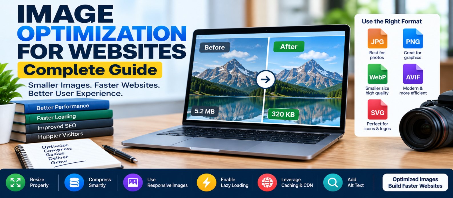
"Learn how to optimize images for websites using proper dimensions, compression, JPEG, PNG, WebP, AVIF and SVG, responsive images, srcset, lazy loading, LCP optimization, caching, CDNs, and accessible alt text."
Image Optimization for Websites: Complete Guide
Images can make a website more useful, attractive, and easier to understand—but they can also become some of the heaviest resources a page downloads.
A high-resolution photograph uploaded directly from a camera may contain far more pixels and data than a visitor's screen needs. Multiply that by hero images, product photos, thumbnails, and blog graphics, and page performance can suffer quickly.
Image optimization means delivering the right image, at the right dimensions, in an appropriate format and quality, at the right time.
Here's how to do it.
Why Image Optimization Matters
Poorly optimized images can increase:
- Page download size
- Loading time
- Mobile data usage
- Largest Contentful Paint (LCP)
- Server and CDN bandwidth
The goal isn't simply to make every file as tiny as possible.
You want the smallest practical file that still looks good for its intended use.
1. Resize Images to Realistic Dimensions
One of the easiest mistakes is uploading an enormous image and shrinking it with CSS.
Suppose you upload:
Original: 4000 × 3000
Displayed: 800 × 600
The browser may still have to download the larger resource even though it's displayed much smaller.
Create appropriately sized versions instead.
Think in terms of actual display requirements:
Thumbnail → Small
Article image → Medium
Hero image → Large
Don't make every visitor download the maximum-resolution version.
2. Compress Images
Compression reduces file size.
There are two broad categories:
Lossless Compression
Attempts to reduce file size without discarding image information required to reconstruct the original data.
Useful when exact pixel preservation matters.
Lossy Compression
Reduces size by discarding some information.
For photographs and similar images, sensible lossy compression can often produce substantial savings while maintaining acceptable visual quality.
Avoid chasing a specific quality percentage for every image. Different images respond differently to compression.
Judge the actual output.
3. Choose the Right Image Format
No single format is best for every situation.
JPEG
A practical choice for photographs and complex images where lossy compression is acceptable.
Good for:
- Photos
- Blog photography
- Product images
It doesn't provide normal alpha transparency.
PNG
Useful when you need lossless raster graphics or transparency.
Good for:
- Certain interface graphics
- Screenshots requiring crisp detail
- Images needing alpha transparency
Large photographic PNG files can become unnecessarily heavy.
WebP
Supports lossy and lossless compression as well as transparency.
It's widely useful for:
- Photos
- Thumbnails
- Website graphics
AVIF
Can provide very efficient compression for many photographic and graphical images.
However, encoding workflow, browser requirements, and image characteristics should be considered rather than assuming AVIF is always smallest or visually best.
SVG
SVG is a vector format.
Excellent for:
- Icons
- Logos
- Simple illustrations
- Diagrams
Because vector graphics scale mathematically, they can remain sharp at different sizes.
SVG isn't intended as a replacement for ordinary photographs.
4. Use Responsive Images
A desktop monitor and a small phone don't necessarily need the same image file.
HTML provides srcset:
<img
  src="photo-800.webp"
  srcset="
    photo-400.webp 400w,
    photo-800.webp 800w,
    photo-1200.webp 1200w"
  sizes="100vw"
  alt="Mountain landscape">
The browser can choose an appropriate candidate based on factors such as layout and device characteristics.
Instead of:
Phone → Downloads huge desktop imageyou can achieve:
Phone   → Smaller image
Tablet  → Medium image
Desktop → Larger image
This can save substantial bandwidth.
5. Understand the picture Element
The <picture> element gives developers more control over image sources.
For example:
<picture>
  <source
    srcset="hero.avif"
    type="image/avif">

  <source
    srcset="hero.webp"
    type="image/webp">

  <img
    src="hero.jpg"
    alt="Mountain landscape">
</picture>
The browser can select a supported source.
picture is also useful for art direction, where different crops or compositions are needed for different layouts.
Don't add multiple formats purely for complexity's sake. Use them when they improve delivery for your audience.
6. Lazy-Load Offscreen Images
Images far below the initial viewport often don't need to download immediately.
Native lazy loading makes this simple:
<img
  src="article-image.webp"
  loading="lazy"
  alt="Website performance chart">
This can reduce initial page work.
But don't blindly lazy-load every image.
Your main above-the-fold image—especially an LCP candidate—usually needs to be discovered and loaded promptly.
7. Don't Lazy-Load the LCP Image
Suppose the hero image is the largest visible element.
This can delay it:
<img
  src="hero.webp"
  loading="lazy"
  alt="Hero">
For an important LCP image, load it normally and consider appropriate priority:
<img
  src="hero.webp"
  fetchpriority="high"
  alt="Hero">
Use fetchpriority="high" selectively. If everything is high priority, nothing is meaningfully prioritized.
8. Always Reserve Image Space
Images without known dimensions can cause layout shifts.
Instead of:
<img src="photo.webp" alt="Photo">provide dimensions:
<img
  src="photo.webp"
  width="1200"
  height="800"
  alt="Photo">
Then keep it responsive with CSS:
img {
  max-width: 100%;
  height: auto;
}
The browser can calculate the aspect ratio before the image finishes downloading, helping reduce Cumulative Layout Shift (CLS).
9. Optimize Image Delivery With Caching
An unchanged logo doesn't need to be downloaded from scratch on every page visit.
Appropriate browser caching allows stable image resources to be reused.
A strong approach is to use versioned filenames:
logo.a821c4.webpWhen the image changes, the filename changes.
This makes long cache lifetimes easier to use without leaving visitors stuck with an old image.
10. Consider a CDN
A Content Delivery Network can serve images through geographically distributed infrastructure.
Conceptually:
Visitor
   ↓
Nearby CDN Edge
   ↓
Cached Image
This can reduce latency and origin traffic, particularly for websites serving visitors across multiple regions.
Some image services can also resize, compress, or convert images dynamically.
A CDN isn't a substitute for sensible image sizes, however. Delivering an unnecessarily huge image from a nearby server still wastes data.
11. Optimize Background Images
Images loaded through CSS also deserve attention.
Example:
.hero {
  background-image: url("hero.webp");
}
Check whether:
- The image is actually necessary
- Its dimensions are appropriate
- Its format is efficient
- Mobile users need the same image
- It is delaying important content
For important content images, HTML <img> elements are often easier for browsers to discover, prioritize, and associate with accessibility information.
12. Write Useful Alt Text
Image optimization isn't only about bytes.
Images that convey meaningful information should have useful alternative text.
Example:
<img
  src="sales-chart.webp"
  alt="Monthly sales increased from January to June">
For purely decorative images, an empty alternative can be appropriate:
<img src="decoration.svg" alt="">Don't stuff keywords into alt text.
Describe the image's purpose in context.
13. Avoid Putting Important Text Inside Images
If a banner contains all of its headline text inside an image, that text is harder to adapt across devices and less accessible than real HTML text.
Prefer:
Background/Image
       +
Real HTML Heading
       +
Real HTML Button
This also makes responsive layouts easier.
14. Automate Image Optimization
For websites publishing content regularly, manually optimizing every image can become unreliable.
A better workflow can automatically:
Upload Original
      ↓
Resize
      ↓
Compress
      ↓
Generate Variants
      ↓
Create Modern Formats
      ↓
Deliver Appropriate Version
Automation reduces the chance that one accidental 10 MB upload damages page performance.
Common Image Optimization Mistakes
Avoid these:
Uploading camera-sized originals and resizing only with CSS.
Converting everything to one format without considering the image.
Lazy-loading the hero image when it is needed immediately.
Forgetting width and height, causing layout shifts.
Using PNG for large photographs without a specific reason.
Serving one image size to every screen.
Compressing too aggressively until images visibly degrade.
Using vague or keyword-stuffed alt text.
Practical Image Optimization Workflow
Use this process for every important image:
CHOOSE IMAGE
     ↓
CROP & RESIZE
     ↓
SELECT FORMAT
     ↓
COMPRESS
     ↓
GENERATE RESPONSIVE SIZES
     ↓
ADD DIMENSIONS + ALT TEXT
     ↓
SET LOADING PRIORITY
     ↓
CACHE
     ↓
MEASURE PERFORMANCE
Then test on both desktop and mobile.
Conclusion
Effective website image optimization isn't one trick.
It combines:
Dimensions → Don't deliver unnecessary pixels
Compression → Remove unnecessary bytes
Format → Choose the right technology for the image
Responsive Images → Match files to screens
Lazy Loading → Delay images that aren't needed yet
LCP Priority → Load important images early
Dimensions → Prevent layout shifts
Caching/CDN → Deliver repeated resources efficiently
Alt Text → Keep meaningful images accessible
The best image isn't simply the smallest file.
It's the image that provides the visual quality users need while consuming as little unnecessary bandwidth and rendering time as practical.
Optimize that balance, and images can improve your website without becoming one of its biggest performance problems.
Get a Free Access To 200+ Free Tools:
|
Home Page |
|
|
Calculator Tools |
|
|
Text & Converter Tools |
|
|
PDF & Image Tools |
|
|
Games & Developer Tools |
|
|
Resume Builder |