
CSS Media Queries Explained: Complete Guide for Beginners in 2026
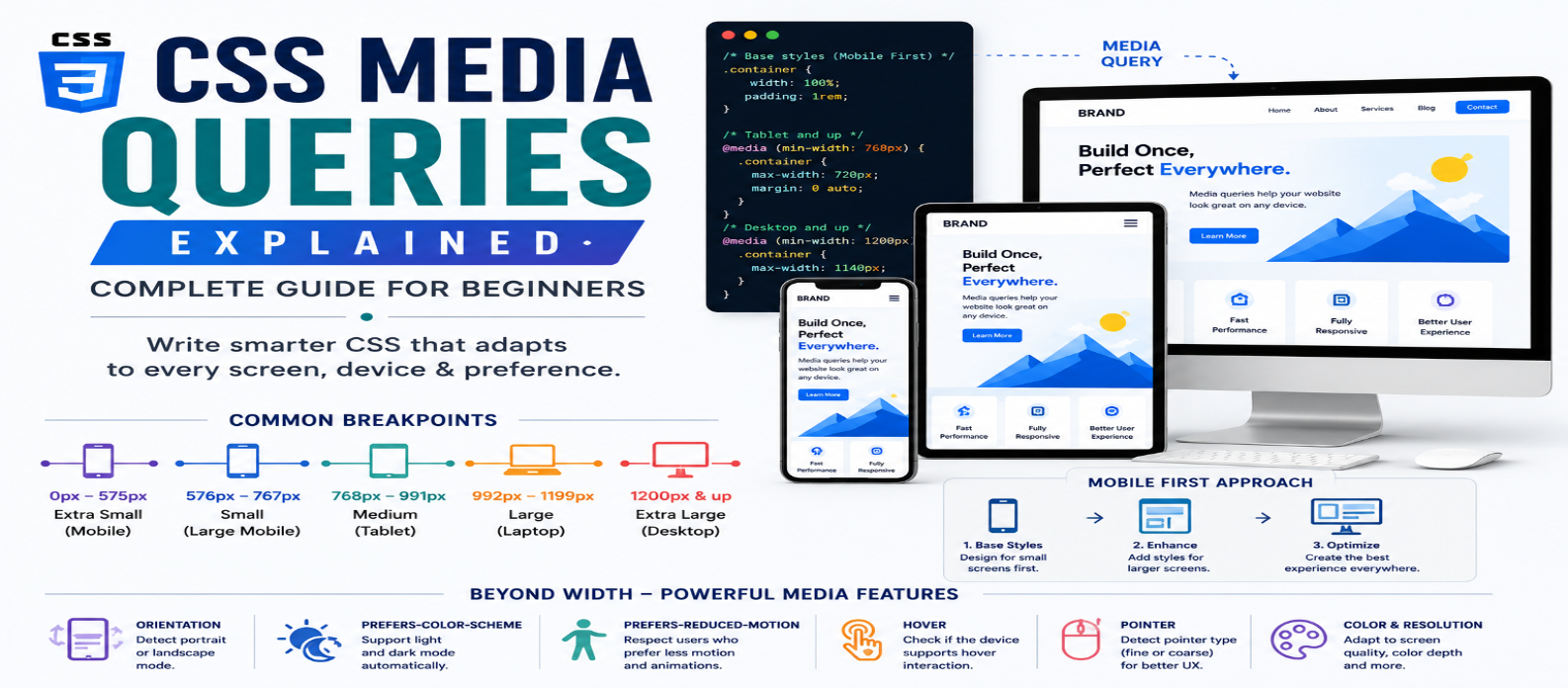
"Learn CSS media queries with practical examples covering min-width, max-width, breakpoints, responsive layouts, orientation, dark mode, reduced motion, hover, pointer capabilities, and modern responsive design."
CSS Media Queries Explained: Complete Guide for Beginners in 2026
A website rarely has enough space to use the same layout everywhere. A four-column grid that works on a large monitor may feel cramped on a tablet and become unusable on a phone.
CSS media queries solve this by allowing styles to apply only when certain conditions are true.
They are commonly associated with responsive design, but media queries can respond to more than screen width. They can also detect characteristics such as orientation, user preferences, hover capability, and color scheme.
What Is a CSS Media Query?
A media query conditionally applies CSS based on characteristics of the browsing environment.
Basic example:
.card {
  width: 100%;
}

@media (min-width: 768px) {
  .card {
    width: 50%;
  }
}
The first rule applies normally.
When the viewport is at least 768px wide, the rule inside the media query becomes applicable.
The basic structure is:
@media (condition) {
  /* Conditional CSS */
}
Think of it as:
If this condition is true → apply these styles.
min-width vs max-width
Two of the most common media features are min-width and max-width.
Using min-width
@media (min-width: 800px) {
  .sidebar {
    display: block;
  }
}
This applies at 800px and wider.
It's commonly used in a mobile-first approach where small-screen styles are the default and enhancements are added as space increases.
Using max-width
@media (max-width: 799px) {
  .sidebar {
    display: none;
  }
}
This applies at 799px and narrower.
Neither approach is inherently invalid. What matters is maintaining a clear, consistent strategy.
Building a Responsive Grid
Suppose you want:
Phone → 1 column
Medium screens → 2 columns
Large screens → 4 columns
Start with:
.products {
  display: grid;
  grid-template-columns: 1fr;
  gap: 1rem;
}
Then enhance the layout:
@media (min-width: 600px) {
  .products {
    grid-template-columns: repeat(2, 1fr);
  }
}

@media (min-width: 1000px) {
  .products {
    grid-template-columns: repeat(4, 1fr);
  }
}
Notice that you don't need to redefine every property.
Only change what needs to be different at each breakpoint.
What Is a Breakpoint?
A breakpoint is a point where the design changes because the current layout no longer works comfortably.
Beginners often search for the "correct" breakpoints for phones, tablets, and desktops.
There isn't one universal set.
Instead of asking:
What is the standard tablet width?
ask:
At what width does my layout start looking cramped or unnecessarily stretched?
For example, if navigation stops fitting comfortably at a particular width, that's a useful reason to introduce a breakpoint.
Let your content and layout guide breakpoint selection rather than targeting every device model.
Combining Media Conditions
Media queries can contain multiple conditions.
For example:
@media (min-width: 600px) and (max-width: 1000px) {
  .layout {
    grid-template-columns: 2fr 1fr;
  }
}
Both conditions must be true.
This creates a range between 600px and 1000px.
Modern media-query syntax can also express ranges more directly in supported browsers:
@media (600px <= width <= 1000px) {
  .layout {
    grid-template-columns: 2fr 1fr;
  }
}
Use syntax that fits your project's browser-support requirements.
Detecting Screen Orientation
Media queries can respond to orientation:
@media (orientation: landscape) {
  .gallery {
    grid-template-columns: repeat(3, 1fr);
  }
}
Possible values include:
portrait
landscape
However, don't assume orientation tells you what type of device someone has.
A desktop window can have unusual proportions, and phones can rotate.
Design according to available space whenever possible.
Dark Mode With prefers-color-scheme
Media queries can respond to the user's preferred color scheme:
body {
  background: white;
  color: #111;
}

@media (prefers-color-scheme: dark) {
  body {
    background: #111;
    color: #f5f5f5;
  }
}
This allows a site to automatically adapt to a user's light or dark preference.
For larger design systems, CSS custom properties can make this cleaner:
:root {
  --background: #fff;
  --text: #111;
}

@media (prefers-color-scheme: dark) {
  :root {
    --background: #111;
    --text: #f5f5f5;
  }
}
Components can then use the variables rather than repeating color rules.
Respecting Reduced Motion
Media queries also help with accessibility.
Some users request reduced motion through their operating system or browser environment.
You can respond with:
@media (prefers-reduced-motion: reduce) {
  .hero {
    animation: none;
    transition: none;
  }
}
Depending on the design, reducing motion may be preferable to removing every transition entirely.
The important principle is to respect the preference.
Detecting Hover Capability
Not every device has a mouse-like hover interaction.
Instead of assuming hover is available:
@media (hover: hover) {
  .card:hover {
    transform: translateY(-4px);
  }
}
You can also query pointer characteristics:
@media (pointer: coarse) {
  .button {
    padding: 1rem 1.25rem;
  }
}
A coarse pointer may indicate less precise input, where larger interactive controls can be helpful.
Avoid treating these features as perfect device detectors. They're better used to adapt to capabilities.
Media Queries Aren't Only About Devices
This distinction is important.
Avoid thinking:
600px = Phone
768px = Tablet
1200px = Desktop
A user might resize a desktop browser to 700px.
A tablet may be used in landscape.
A foldable device may expose unusual dimensions.
Media queries respond to conditions, not necessarily specific device categories.
That mindset leads to more durable responsive layouts.
Do You Need a Media Query for Everything?
No.
Modern CSS can often adapt naturally.
For example:
.grid {
  display: grid;
  grid-template-columns:
    repeat(auto-fit, minmax(min(250px, 100%), 1fr));
  gap: 1rem;
}
This grid can change its number of columns automatically without explicit width breakpoints.
Similarly, flexible sizing can use:
h1 {
  font-size: clamp(2rem, 5vw, 4rem);
}
Use media queries when the design genuinely needs a discrete change, not simply because responsive websites are expected to have many of them.
Media Queries vs Container Queries
A media query usually responds to characteristics of the viewport or environment.
A container query can respond to the size of a component's container.
For example, a card might appear in:
- A narrow sidebar
- A wide article
- A full-width dashboard
Its ideal layout may depend more on its container than the entire viewport.
That's where container queries can be useful.
Media queries remain excellent for page-level responsive behavior, while container queries can make reusable components more context-aware.
Organizing Media Queries
You can keep related responsive rules close to their components:
.card {
  padding: 1rem;
}

@media (min-width: 700px) {
  .card {
    padding: 2rem;
  }
}
Or organize breakpoints into larger sections.
Both approaches can work.
The important thing is consistency. Developers should be able to find and understand responsive rules without hunting through unpredictable files.
Common Media Query Mistakes
Creating Too Many Breakpoints
You don't need a breakpoint for every popular device width.
Overriding Entire Components
Change only properties that actually need to change.
Designing for Device Names
Build for available space and capabilities instead.
Ignoring User Preferences
Media queries aren't just for width. Consider motion and color preferences where relevant.
Using Media Queries When CSS Can Adapt Naturally
Grid, Flexbox, minmax(), auto-fit, and clamp() can eliminate many unnecessary breakpoints.
Practical Media Query Workflow
When building a responsive page:
1. Create the base layout
2. Resize the viewport gradually
3. Find where the design becomes uncomfortable
4. Add a breakpoint there
5. Change only the necessary styles
6. Continue resizing
7. Test narrow, medium, and wide ranges
8. Check user preferences and input capabilities
This approach produces breakpoints based on actual design problems instead of arbitrary numbers.
Conclusion
CSS media queries allow your styles to respond intelligently to different conditions.
Start with the fundamentals:
min-width → max-width → Breakpoints → Combined Conditions
Then explore features such as:
Orientation → Color Scheme → Reduced Motion → Hover → Pointer
Most importantly, don't measure the quality of responsive CSS by the number of media queries it contains.
Use media queries when your layout or user experience needs a meaningful change, and let flexible CSS handle everything else.
Get a Free Access To 200+ Free Tools:
|
Home Page |
|
|
Calculator Tools |
|
|
Text & Converter Tools |
|
|
PDF & Image Tools |
|
|
Games & Developer Tools |
|
|
Resume Builder |