
CSS Animations and Transitions: Complete Guide for Beginners in 2026
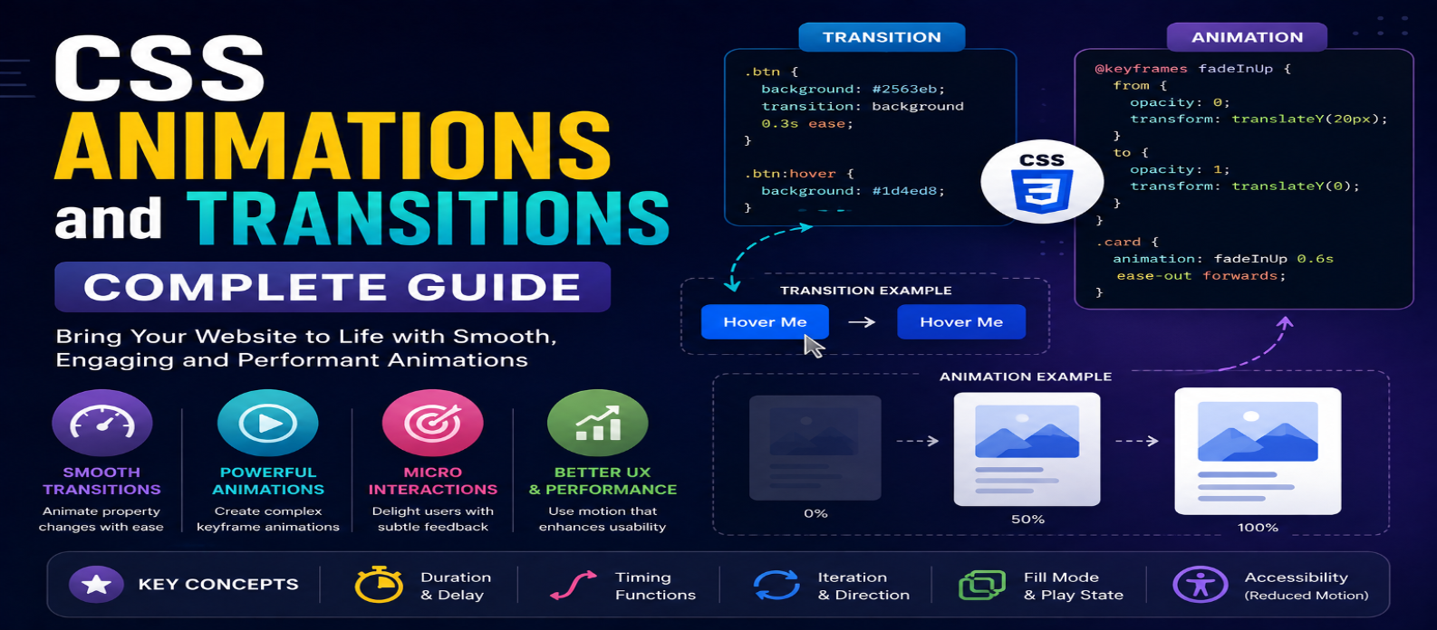
"Learn CSS animations and transitions with practical examples covering transition properties, timing functions, @keyframes, animation controls, performance, micro interactions, and reduced-motion accessibility."
CSS Animations and Transitions: Complete Guide for Beginners in 2026
Motion can make a website easier to understand. A button that smoothly changes color confirms interaction, a menu that gently opens helps users follow what changed, and a loading indicator communicates that something is happening.
CSS provides two major tools for creating this motion: transitions and animations.
Although they are related, they solve different problems. Transitions smoothly move between states, while animations can create multi-step motion with greater control.
This guide explains both with practical examples and shows how to use motion without hurting usability or performance.
CSS Transitions vs Animations
The easiest distinction is:
Transition = State A → State B
Animation = Multiple controlled steps over time
A transition usually needs something to trigger a property change, such as :hover, :focus, or a class being added.
An animation can run automatically and can contain multiple keyframes.
| Feature | Transition | Animation |
|---|---|---|
| Best for | Simple state changes | Multi-step motion |
| Keyframes | No | Yes |
| Can run automatically | Usually needs state change | Yes |
| Repeating | Limited use case | Built-in |
| Control | Simple | More detailed |
Your First CSS Transition
Suppose a button changes color when someone hovers over it:
.button {
  background: #2563eb;
}

.button:hover {
  background: #1d4ed8;
}
The change happens immediately.
Add a transition:
.button {
  background: #2563eb;
  transition: background-color 0.3s ease;
}
Now the browser gradually interpolates between the two colors.
The syntax follows this general pattern:
transition:
  property duration timing-function delay;
For example:
transition: transform 200ms ease-out 0ms;Which Properties Should You Transition?
You can animate many CSS properties, but not all choices have the same performance characteristics.
For interface motion, transform and opacity are often useful:
.card {
  transition:
    transform 200ms ease,
    opacity 200ms ease;
}

.card:hover {
  transform: translateY(-4px);
  opacity: 0.95;
}
Properties that frequently trigger layout work, such as width, height, top, and left, can be more expensive in complex interfaces.
Don't optimize blindly, but prefer simpler motion when it produces the same visual result.
Understanding Timing Functions
Timing functions control how motion progresses.
Common values include:
ease
linear
ease-in
ease-out
ease-in-out
You can also define a custom curve:
transition-timing-function:
  cubic-bezier(0.4, 0, 0.2, 1);
The timing function can significantly change how an interaction feels.
For example, linear maintains a constant progression, while ease-out starts faster and slows toward the end.
Avoid transition: all
This is convenient:
transition: all 0.3s ease;But it tells the browser to transition every animatable property that changes.
It's usually clearer to specify what should move:
transition:
  transform 0.3s ease,
  box-shadow 0.3s ease;
This makes the intended behavior easier to understand and maintain.
Creating CSS Animations With @keyframes
For more complex motion, use @keyframes.
Example:
@keyframes fadeIn {
  from {
    opacity: 0;
    transform: translateY(10px);
  }

  to {
    opacity: 1;
    transform: translateY(0);
  }
}
Apply it to an element:
.message {
  animation: fadeIn 500ms ease-out;
}
When the animation begins, the element moves from the starting styles to the ending styles.
Multi-Step Animations
Keyframes aren't limited to from and to.
You can create several stages:
@keyframes pulse {
  0% {
    transform: scale(1);
  }

  50% {
    transform: scale(1.08);
  }

  100% {
    transform: scale(1);
  }
}
Then:
.notification {
  animation: pulse 1s ease-in-out;
}
This gives you precise control over what happens during the animation.
Important Animation Properties
CSS animations provide several controls.
Duration
animation-duration: 600ms;Determines how long one animation cycle lasts.
Iteration Count
animation-iteration-count: infinite;Repeats the animation continuously.
Use infinite animations carefully because constant motion can distract users.
Direction
animation-direction: alternate;Allows alternating forward and backward playback.
Delay
animation-delay: 300ms;Waits before starting.
Fill Mode
animation-fill-mode: forwards;Controls how animation styles apply before or after execution.
Practical Example: Animated Loading Indicator
HTML:
<div class="spinner" aria-label="Loading"></div>CSS:
.spinner {
  width: 40px;
  aspect-ratio: 1;
  border: 4px solid #ddd;
  border-top-color: #2563eb;
  border-radius: 50%;

  animation: spin 800ms linear infinite;
}

@keyframes spin {
  to {
    transform: rotate(360deg);
  }
}
This creates a continuously rotating loading indicator.
However, the visual spinner alone isn't enough for every accessibility scenario. Make sure loading status is also communicated appropriately to assistive technologies when necessary.
Triggering Animations With Classes
CSS animation becomes even more useful when combined with JavaScript.
CSS:
.panel {
  opacity: 0;
}

.panel.is-visible {
  animation: reveal 400ms ease-out forwards;
}

@keyframes reveal {
  from {
    opacity: 0;
    transform: translateY(15px);
  }

  to {
    opacity: 1;
    transform: translateY(0);
  }
}
JavaScript only needs to change the state:
panel.classList.add("is-visible");This creates a useful separation:
JavaScript decides when something happens.
CSS controls how the visual motion happens.
Respect Reduced-Motion Preferences
Not everyone wants or can comfortably use interfaces with extensive motion.
CSS provides:
@media (prefers-reduced-motion: reduce) {
  .animated-element {
    animation: none;
    transition: none;
  }
}
You don't necessarily need to remove every animation. In many designs, reducing large movement while preserving useful state feedback is better.
The important point is to respect the user's preference rather than treating animation as mandatory.
Transitions for Better Microinteractions
Transitions work particularly well for small interface feedback.
For example:
.link {
  text-decoration-thickness: 2px;
  text-underline-offset: 3px;
  transition: text-underline-offset 150ms ease;
}

.link:hover {
  text-underline-offset: 6px;
}
Other useful applications include:
Buttons → Cards → Navigation → Tabs → Form Feedback → Tooltips
Motion should help communicate a change rather than exist only because it looks impressive.
Common CSS Animation Mistakes
Making Everything Move
If every heading, button, image, and card animates, important motion becomes harder to notice.
Animations That Are Too Slow
Users shouldn't have to wait for decorative motion before interacting with content.
Ignoring Keyboard Users
Don't create useful feedback only for :hover. Consider states such as :focus-visible where appropriate.
Ignoring Reduced Motion
Provide a calmer experience for users who request it.
Animating Expensive Properties Without Need
Use transform and opacity when they can produce the desired effect more efficiently.
When to Use Transition vs Animation
Use a transition when an element changes between two clear states:
Normal Button → Hovered Button
Closed Menu → Open Menu
Inactive Card → Active Card
Use an animation when you need a timeline or repeating sequence:
Loading Spinner
Progressive Entrance
Pulse Effect
Multi-Step Illustration
If a simple transition solves the problem, you usually don't need a full keyframe animation.
A Good Motion Design Rule
Before adding motion, ask:
What does this animation communicate to the user?
Good motion can:
- Confirm an interaction
- Show where something moved
- Communicate loading
- Direct attention
- Explain a state change
If an animation delays the user, distracts from content, or exists only to make the page feel "busy," simplify it.
Conclusion
CSS transitions and animations can turn abrupt interface changes into clear, polished interactions.
Start with transitions for simple state changes and use @keyframes animations when you need multiple stages, repetition, or greater control.
Keep durations sensible, animate deliberately, prefer efficient properties when practical, and respect prefers-reduced-motion.
The best CSS animation isn't necessarily the most impressive one. It's the motion that makes an interface easier to understand without getting in the user's way.
Get a Free Access To 200+ Free Tools:
|
Home Page |
|
|
Calculator Tools |
|
|
Text & Converter Tools |
|
|
PDF & Image Tools |
|
|
Games & Developer Tools |
|
|
Resume Builder |